Glen Millar PowerPoint WorkBench PowerPoint MVP
since 2003
  logic for PowerPoint designers and presenters  
     
  home about blog causes tutorials links contact us  
     

Welcome to these tutorials, many of which were unique concepts when first published!

animatebuildvisualizeinteract2007logicvideo


logic: of presentations

logic 1: presentation structure ] logic 2: tri-pane view ] logic 3: move text fast ] [ logic 4: edit text ruthlessly ] logic 5: notes pane ] logic 6: visual clarity ] logic 7: powerpoint layouts ] logic 8: slide masters ] logic 9: slide grid and guides ] logic 10: ribbon logic ] logic 11: animate with confidence ] logic 12: present with confidence ] logic 13: the ending ] logic14: get powerpoint help ] logic 15: annoying prompts (new) ]


4. Edit text ruthlessly!

logic: ensure good design- text is evil!
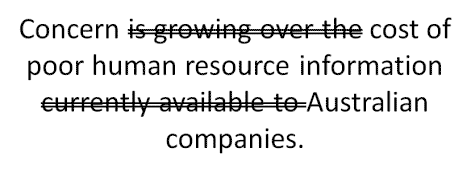
Start to remove superfluous text in any way possible. There are three main points above:

A total novice will leave the text as it is.

A novice will cut down on the amount of words as above.

A reasonable designer will convert the concept to a graphic, probably clip art.

A better designer will source a relevant image with very little text.

A top notch designer will be prepared to get a custom graphic taken (photo) or built.
lack of information

Photo source: Fotolia

Remember- your text can go in the notes page for later printing as handouts.


Google
 
Web www.pptworkbench.com


Copyright (c) 1999 - 2011 Glen Millar

mvp logo