|
6.
Visual clarity
logic: use native PowerPoint features for clarity
Visual clarity depends on contrast between a slides’
background and the various objects on the slide. Well, it’s actually more
complex than that. It also depends on room lighting, and whether the audience is
viewing your presentation on a monitor or projected on a wall.
PowerPoint provides a simple solution to enhance visual
clarity; Themes, which include a set of balanced colors, fonts and effects. A
theme is a “container” for your slide design and holds the styles for your
presentation.

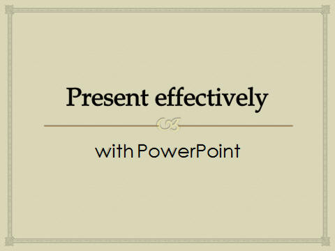
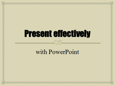
The above three slides are identical, with the Theme wobbly
applied to all of them.
Slide one ahs the default theme added.
Slide two has the Colors changed.
Slide three has the Background style changed.
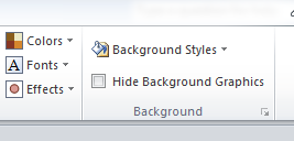
The location for these settings is seen below.

Further options are to change the default fonts (for the
entire presentation). For example, Apothecary font applied:

Newsprint font applied:

It is so easy to change your whole presentation if you use
PowerPoint's Themes.
|

