Logic: Powerful customization of charts in PowerPoint
This
tutorial is an example of making PowerPoint do things that can't
normally be done. In this case, we will tweak some chart animations
that don't exist under normal circumstances.
This will be done in a simple way.
We will:
1. Create a chart with data,
2. Ungroup the chart into individual pieces,
3. Insert pictures that relate to the data,
4. Do some grouping + animation.
While this process will
not be complex, I trust you will learn to look beyond what is available
behind normal program options.This tutorial is assuming PowerPoint 2000. PowerPoint XP (2002)
is vastly superior, and has many more options.
First, start with a chart placeholder on your slide.
Then add data, which in this case is rainfall
numbers in a 3d line chart. You will find the data sheet by double
clicking the chart placeholder object.
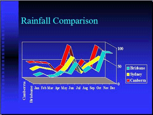
Right click on the chart, select grouping, and ungroup. You will
get this warning message:

This action will lose your data, so make sure
you have another copy somewhere of your chart!
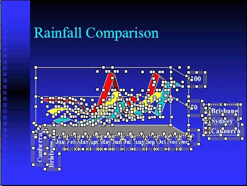
Click off the objects to deselect them. Each one of these objects
can again be combined together into any "group" of objects.
Please note that the two text boxes in this example came about from
the way the chart was placed on the slide. Your example may not
be the same.
We then delete the two text boxes “Canberra” and “Brisbane” in this
example. Replace with three pictures for each location.
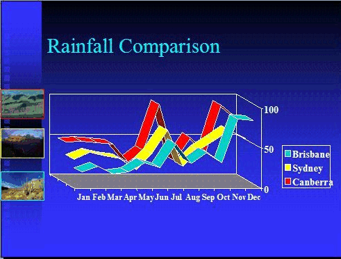
In this example, the pictures were given the same outline colour
as the data ribbons they represent: red, yellow and blue.
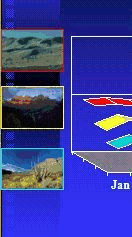
Select the light blue outlined picture, and each part of the light
blue ribbon by clicking one piece, while holding the shift key and
clicking more (ppt 2000 and higher).
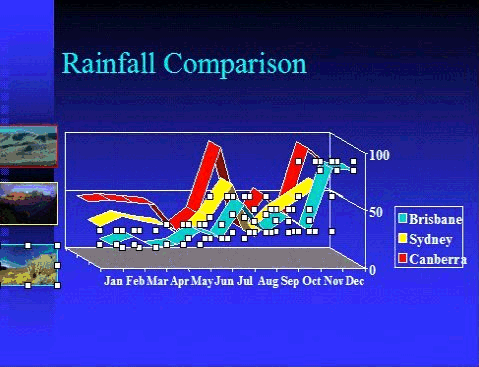
Group the objects, (right click on one of the selected objects and
select grouping). Then set custom animation to wipe right. Repeat
for the other two data series.
Now we show how it works by running it as a slide show. You may
download this example which shows two slides. The first slide has
the original animated chart, and a second with the new animation
format.
DOWNLOAD EXAMPLE
(236 KB).
Please note, this is in PowerPoint 2000. For other formats (97 or
less), please e-mail me and I can send it to you.

